Maderista
ARCHITECTURE
The client
Maderista is a carpentry boutique that offers custom made furniture using only the finest wood. With more than 30 years of experience.
keywords
Carpentry /Furniture /Mexico /Branding /Graphic Design /Interior Design
the objective
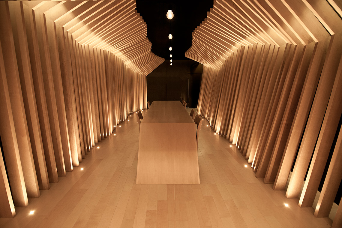
A space that would express it's proficiency and expertise in a modern and all-embracing way.
the solution
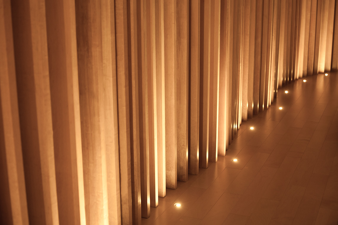
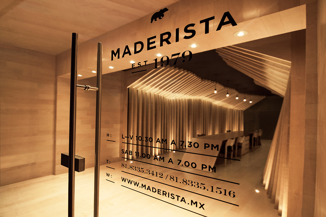
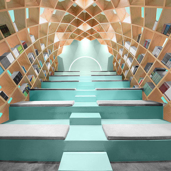
The showroom is aspirational and inviting, designed to inspire and encourage the imagination on the endless possibilities that can be attained from wood.
— (A)
To inspire the imagination on the endless possibilities that can be attained from wood.
Maderista
BRANDING
the objective
Maderista approached us with the need to consolidate its brand with a stronger and more sophisticated design.
the solution
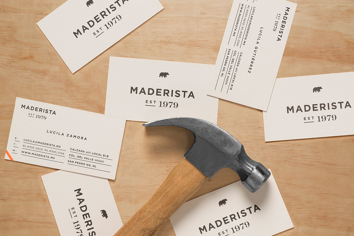
The naming for Maderista is a witty made-up word consisting of two parts: madera, or 'wood' in Spanish and the suffix 'ista', a designation of profession, conviction and character. So the name Maderista, or 'one who works with wood', is explicit of the brand's custom services.
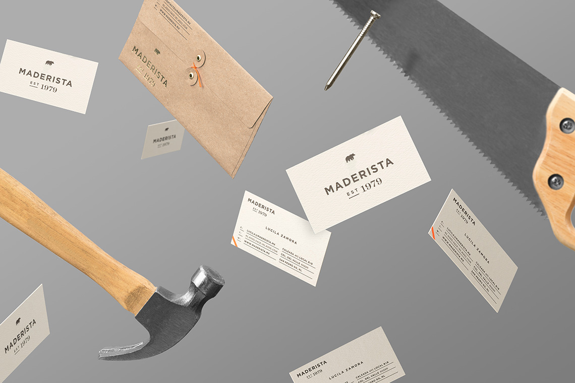
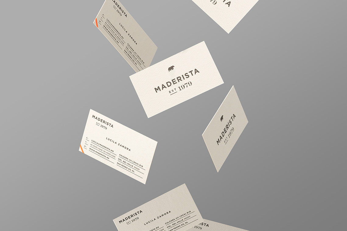
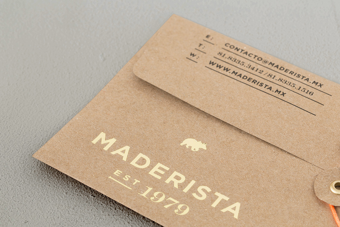
Our proposal for the logo is complex, carrying a typographical palette meant to portray timelessness, a coalescence of modern and traditional, and two iconic symbols: a bear and a nail. The bear embodies the natural strength and robustness of wood, Maderista's primary material, while the nail exemplifies the skilled craftsmanship and thoughtful attention put into each custom-made piece of furniture produced.
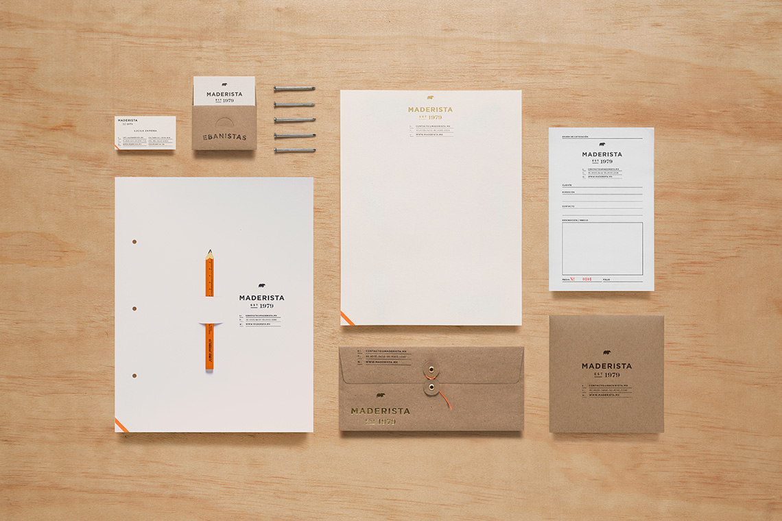
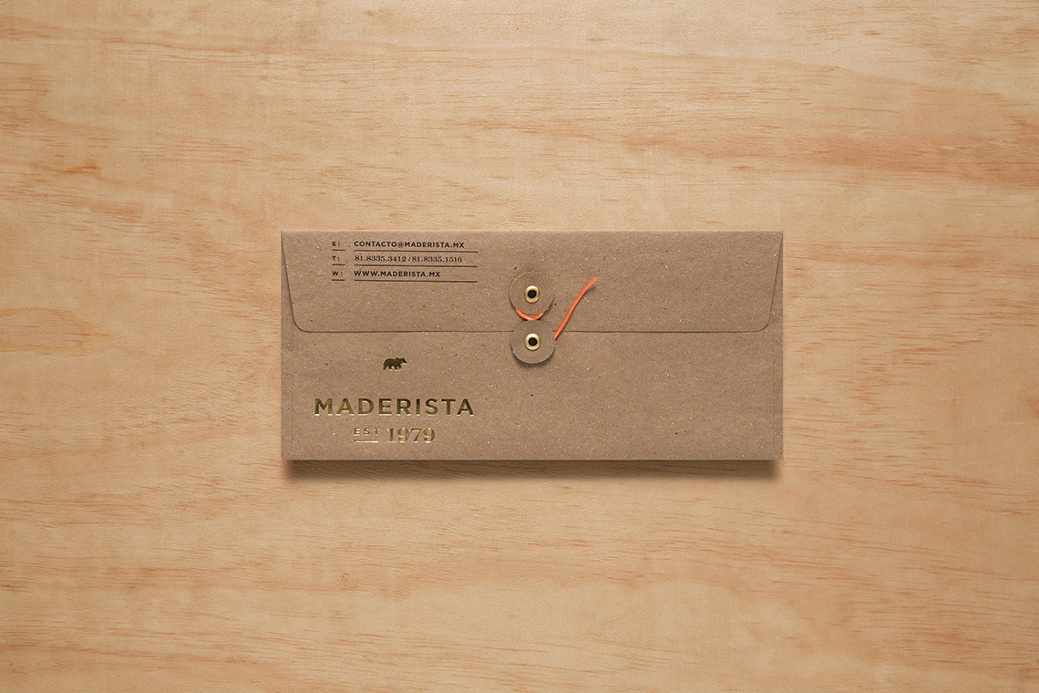
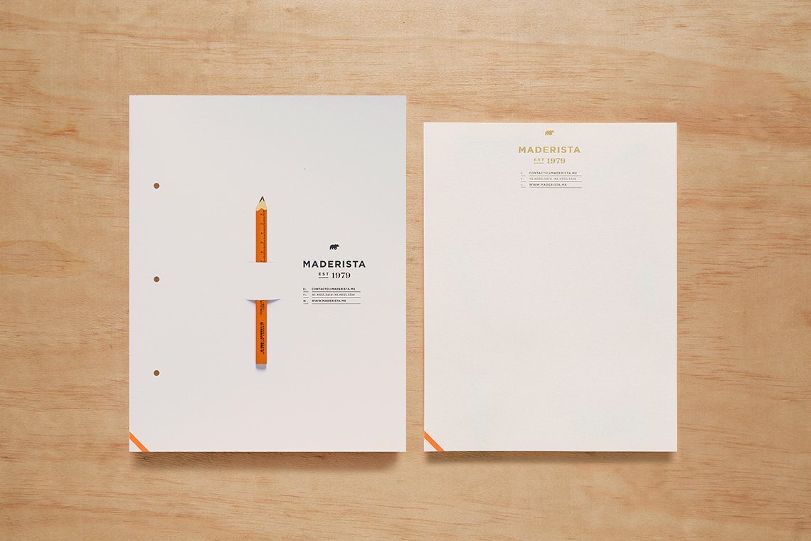
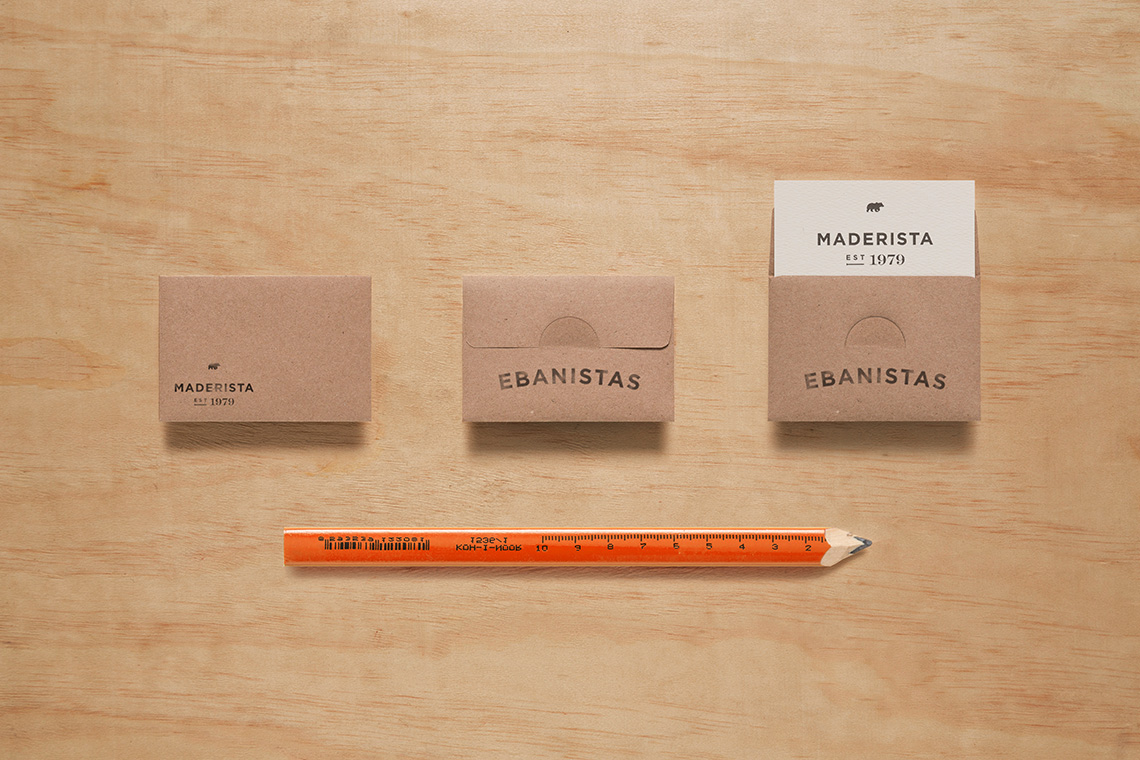
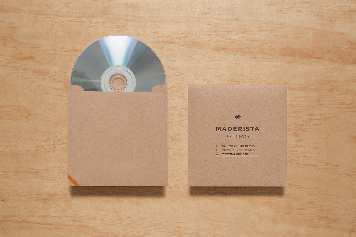
The choice of paper for the stationery: porous, off-white, crafty but with touches of hot-stamped gold, conveys the crafty nature of the brand while embracing its guaranteed high-end quality and class.
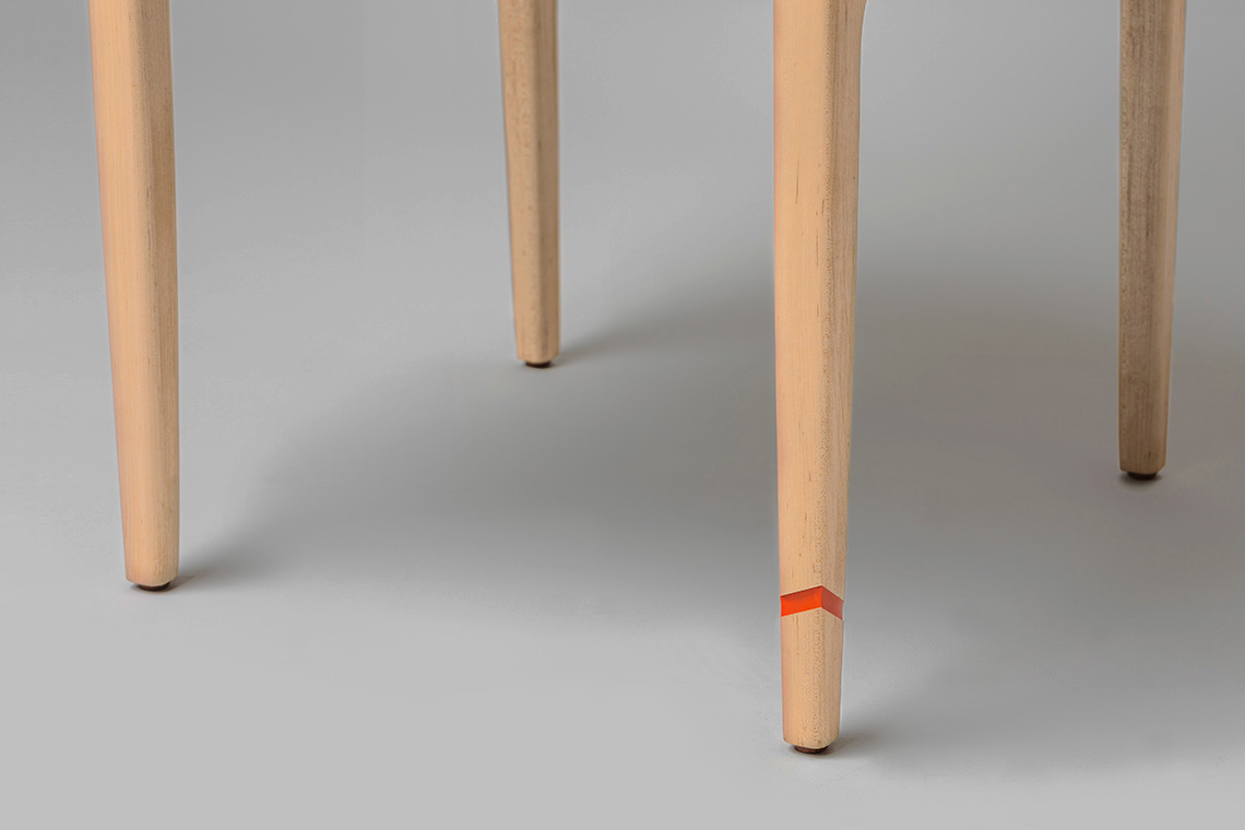
In addition, we designed a small gesture: a small, engraved, orange diagonal line in the left-hand corner, that would set apart every piece of furniture made by Maderista. — (A)
A coalescence of modern and traditional, and two iconic symbols: a bear and a nail.
